Thursday, April 30, 2009

Dusty's Website

Thanks to my techy son, I now have a website to go with this blog. The website will have all the downloads and information from here plus some extras all organised into sections. It is very much a work in progress but I hope you will find it useful. Suggestions welcomed!

It’s at: http://dustydigitals.selsmark.com/

Tuesday, April 28, 2009

Making a string of beads

I use lines a lot on my album pages. They are a quick way to add some design elements and colour and require the minimum of artistic ability. The main trick is in spacing out the brush strokes.

The attached tutorial is for Photoshop Elements and shows you how to create a simple line of dots and gives you some ways to add extra pizzazz with colour and styles.

This tutorial appeared in its original form on the Digital Design Den back when it was a community site. It is now coming back as a Shoppe and will be well worth a visit. YOU'LL FIND THEIR BLOG HERE.

Sorry, link has expired. Check the DustyD website instead.

If you do download, a little ‘love’ in the form of a note or comment would be appreciated.

Friday, April 24, 2009

PowerPoint for Album Pages 02: Borders and Shadows

This is the second in a series of tutes aimed at the family album maker rather than the true digi-scrapper. If you just want to get those photos into albums, this is for you. If you are a great digi-scrapper then maybe this is for a friend or relative.

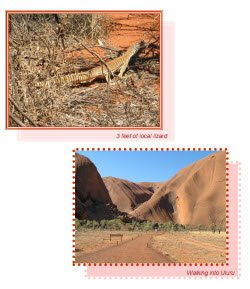
In this tutorial we experiment with adding borders and shadows to individual pictures.


Sorry, link has expired.
Check the DustyD website instead.

Tuesday, April 21, 2009

Get Real! Adding ephemera to your album pages

The librarian part of me loves the word ‘ephemera’, it sounds like something made of gossamer and wisps of air. Ephemera is actually almost that. It is anything that is only meant for now, things that don’t last and that are of transitory value. Things like ticket stubs, a handout at the school fete, a note or letter, the wrapping around a gift, the signed docket when you take delivery of a parcel…, all of these are ephemera and a little ephemera can add extra value to the stories in your family albums, especially if your albums are like mine and are more visual diaries than photo albums.

There are already a couple of examples in my posts. Two posts ago the page about my DGS’s birthday included a part of the invitation to the party and in the March 17th post, I used an invoice as a background.

Today I’ll look at using notes, those scribbled bits of paper that were never meant to be kept but that are so much fun to look back on later.

Here’s an example from some years back. We were visiting our kids who were living in Esperance. While we were out exploring, our DGS took a nasty fall and his frantic parents raced him off to the local hospital. We arrived home to find a worrying note on the door. All ended well and the note was added to the page when the story was told in words and pictures.

Here’s another page with a note I kept. DGS was having an extended sleep over and my super organised DD was making sure every detail was covered. My favourite bit of this note is the last line ‘Quiche in fridge’.

And one last one, this time a post-it note. Our DS living in the goldfields had trusted us with the task of picking out a new puppy. He’d rung up and given my DH a list of things we had to check and DH had scratched it down on the nearest bit of paper – which I kept! It is now part of the page that tells the story of selecting our beautiful grand dog.

All of these notes were scanned and the images added to the event folder. If you don’t have a scanner, take a photograph of it instead. You may need to use your macro setting to get a clear shot so experiment and see how you go.

I’ll talk some more about ephemera in future posts. And please let me know if you find this useful. Questions welcomed too.


Digi-Scrap Princess at Sum Scrapper

I have to celebrate this event with a post. Nita, aka the Digi-Scrap Princess, has joined Sonya, Marcie, Ellie, Rhonda and the others at Sum Scrapper as a designer. And here's a page I did for MiL's book using her latest kit Elizabeth Pt 1.

The kit contains a wonderful striped paper which I used for the name band here. I cropped out a portion of the paper, applied a bevel, nibbled away some of the end and here is the result. I think MiL will like this one, she looks so glamorous.

You'll find Sum Scrapper here and Digi-Scrap Princess' shop here.

Monday, April 20, 2009

Another OP with space for extras

Here’s another OP that has space for adding stories or additional elements. In mine I’ve put the story of the multiple cakes my daughter made for DGS’s birthday.

The background is based on the colours in the bouncy castle and maybe I’ll make it a download next time.

Sorry, link has expired. Check the DustyD website instead.

Sunday, April 19, 2009

Another birthday and a cascading template

September is our family’s month for birthdays so it was no surprise to find the next folder waiting for its entry into the family album was our eldest grandchild’s birthday. His parents arranged for a bouncy castle to be put up in the backyard and this was just heaven for Jack. In the morning his friends came over and in the afternoon it was family time and he and his cousins had the castle to themselves.

I wanted a first page layout that celebrated the wonderful fun the kids had tumbling down the slide out of the castle so here it is – a cascading template. The background is a faded pic of the bouncy castle itself. This is another template that is good for mobile phone pics as there are lots of smaller images on the page.


Sorry, link has expired. Check the DustyD website instead.

Wednesday, April 15, 2009

Some more OP template freebies; US letter and A4

I love OP templates and the way pages fly together. Just set the cropping tool to the right size and then drag and drop images into place. I get such a sense of accomplishment when it all comes together.

Here are the two extra pages for my Bro’s 60th using a very simple and very adaptable template which I have provided in both A4 and US letter sizes. As you can see from my two pages, you can flip the template to create paired pages and I also combined four small pics to accommodate an important single pic. Minor adjustments that are fast to make but they add interest to your album pages.

Now I just need to run off all three pages again and put them into my Bro’s pick-up basket for him to take home and put in his family album.

A brother as good as this one is well worth taking care of.

Credit for BG paper:
Digi-Scrap Princess' Charity Kit


Sorry, link has expired. Check the DustyD website instead.

Tuesday, April 14, 2009

Creative Block

Do you ever hit a creative wall and find that your head contains not one useful idea on how to proceed? I did when I looked into the next folder in our family story. The images are all from my brother’s 60th birthday and I just couldn’t see how to go forward. I knew I wanted to do a digi-scrap first page followed by some OPs (other pages) but inspiration wasn’t coming. I’d already been through the images several times hoping the idea would jump out at me but this time that didn’t work.

So I did the absolute reverse, I went looking into my supplies and it was while I was in Digi-Scrap Princess’s Charity kit that I saw the filmstrip element and that gave me what I wanted – an idea! So here is my brother’s first page with the film strip holding images of him through the years.

If you like the idea, here are some sketches in square format, US letter and A4 for you to use and adapt. No download as they are only small sketches so feel free to right click and save.

Now I can get stuck into the OPs about Bro’s big day.

Credits:
Digi-Scrap Princess' Charity Kit
Font: Pristina

Wednesday, April 8, 2009

Using PowerPoint to create album pages: Tutorial 01

To keep faith with the mission of getting photos into places they can been seen and enjoyed, I have started work on a series of tutes aimed at the family album maker rather than the true digi-scrapper. If you just want to get those photos into albums, this is for you. If you are a great digi-scrapper then maybe this is for a friend or relative. Please let me know if these are useful and I will keep them coming.

The first tute covers page set up and image resizing and cropping. Here’s how it starts:

I used PowerPoint to make up my album pages for nearly 10 years and it is a great alternative for folks who just want to get that album done without having to go through the learning curve of a program such as Photoshop. Also PowerPoint (PPT) comes with MS Home Office suites so most folks will have it on their computer. I am also aware that Open Office has a program called OOo Impress in its suite, a PPT equivalent, which has the added advantage of being free.

PowerPoint offers several advantages to the family album creator including:
  • all the pages for a particular event are together in the one file – a great advantage for things like weddings and holidays
  • you can easily change the page order
  • you can set up a background template that then works for all pages
  • basic image editing tools allow you to crop, alter brightness and contrast and adjust image size
  • drawing tools allow you to create shadows and borders
  • text boxes and Word Art are on hand and easy to use
Sorry, link has expired. Check the DustyD website instead.

Monday, April 6, 2009

Little pics on a 12x12 page

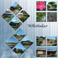
I am finally making a start on my DMIL’s memories book. For years she and DFIL lived in a house near the beach. When they left we took heaps of photos so she could remember how it was. This is one of the pages about that home.

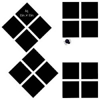
All the pics on this page are 2in x 2 in. Here’s how I did the diamond shape crop in PSE7.
1. Open pic and immediately make a duplicate layer
2. Rotate the whole image 45 degrees right
3. Set crop to 2in by 2 in and make the crop in the duplicate layer
4. Rotate the whole image 45 degrees left
5. Copy the diamond shape over to the template. It should have a transparent background so you won’t have any extra white to worry about.


Credits: BG paper is my own, Font is Pristina. The download file has a flat 12in x 12in template.

Sorry, link has expired. Check the DustyD website instead.

Sunday, April 5, 2009

Adapting templates and a US letter version

Sometimes I use templates exactly as they are and sometimes I adapt them to suit what I am doing. The template I used for today’s set of dusty digitals is one of my favourites and I have used it a lot when doing OPs for wedding albums.

Here I have adapted it by dropping the size of one picture space to allow for a heading and by using a picture space for journaling.

I have so many friends in the US thanks to digi-scrapping that I thought I’d adapt this OP to US Letter size and see how it goes. If there is enough interest then I will do the same with other templates.

Sorry, link has expired. Check the DustyD website instead.

Saturday, April 4, 2009

Make the most of a good background

Time to do the album pages for DG’s 3rd birthday. I digi-scrapped the first page and then used OP templates for the other pages. OPs can look very ordinary but if you carry over a great background, then they suddenly have lots of life and clearly all belong together as a set.

The background for this group of pages was made using a beautiful background paper from Robyn Littlejohn’s Essentials kit overlayed with a low opacity image of the birthday balloons. I used that same background in the OPs. I’ve mentioned how I do this before but it bears repeating. Set up the background, choose the OP template, drag it OVER the background layer and then crop and move pictures into place. Then delete the template layer and continue to embellish. In my case, I added a major element used on the first page to each OP which also helped bind them as a set.
It took me ages to make the digi-scrapped page but the OPs, two of which are shown here, were very quick.

Credits: Robyn Littlejohn’s kits: Essentials and A touch of Spring.
Font: Monotype Corsiva

The download has two version of the same A4 template as shown in the clip opposite.

Sorry, link has expired. Check the DustyD website instead.

Thursday, April 2, 2009

Home made photo book using PowerPoint

My grandkids love to see themselves in photos and especially love it when I make a little story book that is all about them. Now I know you can go the professional route with photo books, and I do that too, but this is the fast, home made version. These books don’t have the polish and pizzazz of professional books but my grandies love them anyway and read them to death. They are ‘for now’ books, not keepsakes.

Here’s my recipe. I create my books using 4 pieces of A4 white 200g card stock printed on both sides. They are printed in landscape with two story pages to a side. The binding is done by punching holes along the centre line and then stitching through the spine with a big needle and strong thread. I use crochet cotton. Too easy! The hard part is working out where the pages go so that when it is all put together, the pages turn over in story order.

I solved that by creating a PowerPoint template with 8 slides, each with the appropriate page number at the bottom of the two sides. Now I can insert images and put in text in the right order. I don’t use the word processor as I prefer the ease with which PPT lets you move and adjust text and images on a page. It is best to downsize your images to 72dpi before inserting them in to PowerPoint. A full story page photo would be about 135mm x 220mm x 72dpi.

Printing has its challenges as you must get the right pages back to back for the book to work. Here is how it goes for a 16 page book.

P1 / P14 back to back with Cover/Back
P3 / P12 back to back with P13 / P2
P5 / P10 back to back with P11 / P4 and
P7 / P8 back to back with P9 / P6

How you layout your book is up to you. I’ve made them two ways as you can see in the image. I’ve also mixed it up – it depends on how many photos I have and how much I want in the story. The examples I’ve given here are my GD’s 3rd birthday. On the back cover, I put a colouring in image so she can add something herself to her book.


The download has the A4 landscape .ppt file as shown on the far left. If you need to alter the page dimensions to suit another page size, go to File/Page Setup and enter your own values.

Sorry, link has expired. Check the DustyD website instead.