Monday, March 30, 2009

Making the most of mobile phone pics

When I got my new iPhone I was entranced with its ability to take halfway decent photos. Not as good as my ‘real’ camera but not too bad either.

My next dusty folder contained only mobile phone images and their resolution meant they looked better as small pics. To make the most of them I made up a page that used nothing larger than a 50mm x 50mm image with the exception of one major photo which was used as background with its opacity set to 50%. There its less than stellar resolution was actually an advantage and added to the overall effect.


Font credit: Billo Dream

The A4 template is in the download. If you do download, a note or comment would be appreciated.

Sorry, link has expired. Check the DustyD website instead.

Thursday, March 26, 2009

Fun space on an A4 template

My next event folder had heaps of photos inside so that called for a template with lots of photo places. I ended up using two versions of the same template to create a 2 page spread in the album. This template has a huge empty space which I’ve labelled ‘Fun space’. You could do all sorts of things here; let your creativity run wild!

I actually went simple and put a major photo in the background. On the left hand side I did get a little creative with layers and created an image with a faded background but with my DGD in full colour. As her page also told a story, I added some close-ups of her face, set transparency to 70% and then used those squares to add story details.


In the download, you’ll find the flat template for both sides.

Sorry, download has expired
Please leave me a little note or comment. I’d love to know how you will use them.

Tuesday, March 24, 2009

A DSP followed by matching OPs

This morning’s task was just too much fun. Now I think I need a good cup of tea and a lie down to recover.

The next batch of dusty digitals was my youngest DGD’s 1st birthday party and I had heaps of images. Such a special event deserved special treatment so I digi-scrapped the first page and then followed it with another 4 matching OPs.

To achieve the matching, I used the same background paper and also followed through with a character I created based on DGD’s birthday cake, a lady bug. I ferreted around my collection of OP templates for ones that matched what I wanted and away I went. When all pictures were in place in a page, I deleted the template which let the backgrounds show through. Then I grouped the images and shrunk them down a bit to allow a border of background around the edge. Then I put the ladybug in and job done.

Credits for the DSPage: Digi-Scrap Princess's Kit 'Charity'
Her blog is here.

The A4 template for the top OP in the combo is below for you to download.

Sorry, download has expired

Monday, March 23, 2009

Managing files

I’ve just had four very busy days. Thursday and Friday I did relief teaching in the sort of school they make movies about (rough tough kids with heaps of attitude) and then Saturday and Sunday I did a botanical water colour workshop in Kings Park. It may surprise you to know I enjoyed both experiences although the first I’m not in a great hurry to repeat anytime soon, need to get my energy levels back first.

So it’s back to my dusty collection of family photos waiting to be put into the album.

Now I like to think I’m well organised when it comes to storing my digital images but then something happens that blows that conceit right out of the water. In preparation for doing MiL’s album, I trawled my collections and copied anything that might be useful into one big folder so that DH could then go through and work out what he wanted to include.

But my system had failed at the final hurdle, renaming individual files, so the folder I prepared had heaps of files with names like DSC_0035.jpg and PRscan_049.jpg. How embarrassing! Some were better in that they had the date and event front end, eg 050623-Ds-21st-006.jpg. Others, particularly some of the scans of family photos and negatives, had details of the actual photo itself, eg 601225-S&M-under-tree.jpg, so it wasn’t all bad. But it was a reminder to be better disciplined in future and follow the system.
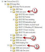
Here’s my system for digital photos coming in as new images, scans of older images I do a little differently so they may get their own post another day.

The clip from my hard drive shows how it works. I create a folder for each event within another folder that covers a 6-month time period (1). Trips have their own yearly folder (2). Folders are named using a yy-mm-dd convention so that the computer’s filing system displays them in true date order.

As I create album pages for the events, their folders are moved into the Processed pics folder (3). When an entire year is processed, the folders are cut to DVDs to share around the family, an effective way to not only share but to create off-site backups as well. The folders are moved into the Annual Collections folder.

Now the bit I’m not so good at doing. Files within each event folder are renamed using a yymmdd-event-nnn.jpg convention. The nnn is generated by whatever means I have used to rename the files in the folder. This is usually inside ACDSee but you can also do it in Windows Explorer although its method is a little odd at first. Basically, you select a range of files and use a Rename command; in Windows it is under the File menu and in ACDSee it is in the Edit menu. Specify the new name you want and how you want the numbering to be formatted. ACDSee gives you options about how you want the numbering to be done, Windows doesn’t.

Do you have a great system? Please share!

Friday, March 20, 2009

In the midst of OPs there comes a DSP

This day’s work on the family album was very rewarding. I had already done a 12x12 layout for the next set of photos which was posted at the Digital Design Den (sadly now closed) and I just needed to convert it into an A4 page.

So here are the before and after images. The 12x12 version was done as a selective colouring challenge. By the time I got to the A4 version I was more interested in getting the page finished, printed and into the album. Hopefully the family won’t care that I didn't carry the idea across to the new photos.

The conversion is very simple. Open the 12x12, alter image size to 210mm wide, and then alter the canvas size to be 210mm wide and 297mm deep with the original image at the top of the page. Most times I can just stretch the background to fill the empty space at the bottom. Then the page has to finished off. This one just had some extra frames added but sometimes the balance of the page needs to be tweaked to accommodate the change in size and shape.

I used Sandy Collin’s ‘Exotic Rust’ kit to create the page. Fonts used are: Eccentric Std and Pristina.

....

Wednesday, March 18, 2009

Boring but functional

Today’s page is boring but functional. Sometimes that is the fate of an OP, not every page gets to really shine. It is also an example of getting two sets of photos on to the one page. Sometimes you only have a few shots for each event and stretching them onto a full album page is just too much ink and too much good photo paper. Better to let them share a page and cut a cost or two.

If your events are sharing a page, then you will still want to get the most out of the photos so don’t crimp the image for the sake of space for the story. Most images have some space that can take a bit of text. Look for very dark or very light sections, both very useful for overlaying text and titles without sacrificing the image and its essential message. Advertisers do it all the time and we think nothing of it and as for magazine covers…

Looking at the page below a true digi-scrapper might have an eyebrow lifting moment and mutter something like ‘that’s not a real layout!’ And they’d be right, it isn’t. It is a page for a family album and in the sequence of events in our family; poor Nhimu had her op around the same time as I was babysitting my DGD so the photos ended up following each other. Such is life.


This template is very simple and it also offers opportunities to swap bits around. It is a useful OP for wedding and holiday albums. If you want to, you can take out one of the smaller images and substitute titles, stories or other embellishments.

This is good. Thanks to the Blog I now I have two more lots of photos moved from the ‘to be processed’ dust pile to the ‘completed’ pile. I may as well make the most of it because as soon as DH has sorted through the photos for MiL’s book I’ll be back to 12x12 with a vengeance and the family album will fall behind again.


The download has the flat 300dpi jpg template ready to use as a base.

Sorry, link has expired (available for one month)

Tuesday, March 17, 2009

A4 template and construction method

Here’s the template for the A4 version of the 12x12 I posted yesterday. This is the size I print at home for putting into my family albums.

The sample page shown here was created in about 15 minutes from start to print. Not bad when the aim is to get the dusty photos off the hard disk and into the family album and if you can read the date you will see I am currently about 8 months behind, time to do some catching up. The subject matter, getting new curtains, isn’t earth shattering but it was a significant event in our house so worth going in our album/family visual diary.

Here’s the method I used:
  • Open the flat jpg in Photoshop Elements and IMMEDIATELY make a duplicate and rename it to fit the pictures being dusted off
  • Open up the images I want to use
  • Then for each part of the base template:
    • set the cropping tool to the required size making sure I have the dpi set as well, in this case to 300
    • crop image and drag it over to where it belongs using the base template as a guide
  • For added interest, I scanned the invoice, added it under the photos and reduced its opacity to fade it a bit
  • Add some text to tell the story
  • Add a line of decorative dots, a unifying feature in a lot of my album pages
  • Hide the base layer and review the page, moving things around if necessary
  • Save
  • Print
It suited my purpose to have some images 4x8 rather than the 4x4 on the template but this was an easy adaptation to make. If you use these templates, you’ll see ways to adapt them for your purposes too.


The download has both a layered psd file and also a flat jpg.

Sorry, download link has expired.