Saturday, December 26, 2009

and you thought you'd got all your presents...

Hop on over to SumScrapper for a one day super special - everything in the store is 50% off on Saturday December 26th.

I've got my eyes on Pammy's Xmas Wishes for my 2009 Christmas pages.

I've also been hankering after Marcie's Color My World, with its fabulous primary kid colours - perfect for paging up my grandies.

Thinking about those grandies, DigiScrap Princess' Hope would be great for the granddaughters. The kit is celebrating women battling breast cancer but it is lovely enough for little girls as well.


I could go on but it is better you go see for yourself.
See you there!

Friday, December 18, 2009

Great album making from AlbumWorks

I've just finished two amazing terms filling in as Teacher Librarian at a great girls' school while the real TL was off on maternity leave and have retired - again! And this time for good. Time to get back into the fun of digi and dusting off my photo stock pile.

My first big project was to make a Christmas present for my daughter. I wanted to make her a photo book about the first 5 years of her son's life. I wasn't looking forward to doing battle with album software, most I had tried in the past were not all that user friendly. But the fates were looking after me and I had an email about Album Works so I gave them a try. Bliss! The album software was intuitive and allowed for lots of customisation. They delivered with blistering speed and the quality was superb.

They are Australian based but they also deliver internationally. Give them a look at: www.albumworks.com.au/

Monday, September 28, 2009

Dabbling with design

I've enjoyed the wonderful digi-scrapping things made by others and now I'm having a go as well. I am so lucky to have good friends over at SumScrapper who are being very patient with a new designer. Sonya has let me set up a shoppe there and it is exciting to see it growing with new items. I've been making mostly brushes but now I am also doing swatches and botanical extractions as well.

One of the really great things about Sum Scrapper is that it is a community. There is a forum for sharing and gossiping and, major bonus, because Sonya is a professional photographer, we also get lots of help and assistance with our photo taking as well.

So if you like the support of a community plus access to lovely kits then get yourself off to SumScrapper, we'd all love to see you there! And when you get there, hunt down the freebies.

Sunday, July 19, 2009

What's that you say?

Using speech bubbles can add an extra twist to otherwise ordinary images. This family album page is a good example. I had the photos of our dog and our son's dog jostling for position of top dog while son's cat watched from a safe distance. The pictures weren't great and I only had a couple. What to do?

The cat on his chair gave me an idea and once he was made Director, I just had to come up with lines for the dogs and turn their images into strips of film by adding holes along the edges. Now the page has a humourous tone and is much more interesting.

I only use this technique occasionally but it is always fun to do. Give it a try!

And which one is our dog? The cutest one of course.

Credits:
Fonts - Tekton Pro; Franklin Gothic Medium; Arial
Overlay on background - thanks to Laitha - Mariella Carugati products, available at PickleBerry Pop

Saturday, June 6, 2009

Mobile phone pic too small?

No problem! You can always 'go large' with the design of the page instead.

As so often happens, perfect photo opportunities occur when the good camera is too far away and you know the moment will pass all too quickly. That's when I tend to whip out the mobile phone and snap away with fingers crossed. I know the picture will be low res and if I'm lucky, in focus as well so it can still be used.

This page shows one of those moments. DH had just bought a new iPhone and downloaded an interactive story book for DGS to play with. The looks on the faces show how successful the whole idea was.

I still have to add some story to this page but as you can see, I have lots of room left. Maybe up the top there perhaps?

I used DigiScrap Princess' new kit Annie's Rain for the page. It's available at Sum Scrapper now. The font is PalaceScript MT.

Monday, June 1, 2009

Australiana

I have been having a lot of fun putting together elements and papers with a strong Australian theme that I hope will be used by folks who travel about our great country and then want to put together a travel album with all their pictures. As I have heaps of dusty pics in travel folders myself, I am also designing and developing things for me too. I'm hoping that if it works for me then it'll work for someone else as well.

Here is one of our travel pics taken just out of Kalgoorlie at the old bush two-up ring, now abandoned and falling into ruin. There is corrugated iron everywhere and that inspired me to create a corrugated iron background for my page.

The title, Come in Spinner, comes from the call made at the two-up as the person in the middle tossed the two pennies in the air. Bets were laid on how the coins would fall and fortunes were made and lost at the ring. Conditions there were never luxurious. The little picture at the bottom left is of a semi-circle of corrogated iron painted white with the sign 'LADIES' painted on it.


If you like the background, you can download it here.

Credits:
Fonts - Adler, Arial.
Grunge overlay - Pineapple Plantation Designs


If you do download, a little ‘love’ in the form of a note or comment would be appreciated.

Tuesday, May 12, 2009

Cake me to your eater

This has little to do with actually making photo albums and more to do with what ends up in them, well end up in mine anyway.

My DD is a CSI, a tough job at the best of times. As a sideline, she does cake decorating and she's darn good at it! I have lots of pages featuring her bent over with a piping bag in hand adding her special touch to yet another great creation.

She calls her business Cake Me To Your Eater and her website has just been updated. Take a look here.


Credits:
Title font: Arruba

Tuesday, May 5, 2009

Another 12 x 12 page for small images

I’m back at work on MiL’s album and doing another page with small pics from her old home ‘among the gum trees’. All the diamonds and squares are just 2” square.

This is a companion page to one that appeared earlier on… oh my gosh, the 6th of April. I really need to do more work on that book or it won’t get finished!

Credits:
Font: Pristina
Elements: ribbon and gum nuts are my own

Sorry, link has expired but you can access it from the Dusty Digitals website.

If you do download, a little ‘love’ in the form of a note or comment would be appreciated.

Thursday, April 30, 2009

Dusty's Website

Thanks to my techy son, I now have a website to go with this blog. The website will have all the downloads and information from here plus some extras all organised into sections. It is very much a work in progress but I hope you will find it useful. Suggestions welcomed!

It’s at: http://dustydigitals.selsmark.com/

Tuesday, April 28, 2009

Making a string of beads

I use lines a lot on my album pages. They are a quick way to add some design elements and colour and require the minimum of artistic ability. The main trick is in spacing out the brush strokes.
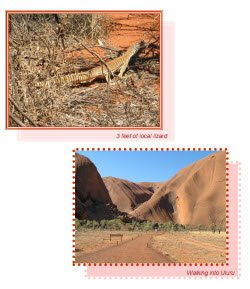
The attached tutorial is for Photoshop Elements and shows you how to create a simple line of dots and gives you some ways to add extra pizzazz with colour and styles.

This tutorial appeared in its original form on the Digital Design Den back when it was a community site. It is now coming back as a Shoppe and will be well worth a visit. YOU'LL FIND THEIR BLOG HERE.

Sorry, link has expired. Check the DustyD website instead.

If you do download, a little ‘love’ in the form of a note or comment would be appreciated.

Friday, April 24, 2009

PowerPoint for Album Pages 02: Borders and Shadows

This is the second in a series of tutes aimed at the family album maker rather than the true digi-scrapper. If you just want to get those photos into albums, this is for you. If you are a great digi-scrapper then maybe this is for a friend or relative.

In this tutorial we experiment with adding borders and shadows to individual pictures.


Sorry, link has expired.
Check the DustyD website instead.

Tuesday, April 21, 2009

Get Real! Adding ephemera to your album pages

The librarian part of me loves the word ‘ephemera’, it sounds like something made of gossamer and wisps of air. Ephemera is actually almost that. It is anything that is only meant for now, things that don’t last and that are of transitory value. Things like ticket stubs, a handout at the school fete, a note or letter, the wrapping around a gift, the signed docket when you take delivery of a parcel…, all of these are ephemera and a little ephemera can add extra value to the stories in your family albums, especially if your albums are like mine and are more visual diaries than photo albums.

There are already a couple of examples in my posts. Two posts ago the page about my DGS’s birthday included a part of the invitation to the party and in the March 17th post, I used an invoice as a background.

Today I’ll look at using notes, those scribbled bits of paper that were never meant to be kept but that are so much fun to look back on later.

Here’s an example from some years back. We were visiting our kids who were living in Esperance. While we were out exploring, our DGS took a nasty fall and his frantic parents raced him off to the local hospital. We arrived home to find a worrying note on the door. All ended well and the note was added to the page when the story was told in words and pictures.

Here’s another page with a note I kept. DGS was having an extended sleep over and my super organised DD was making sure every detail was covered. My favourite bit of this note is the last line ‘Quiche in fridge’.

And one last one, this time a post-it note. Our DS living in the goldfields had trusted us with the task of picking out a new puppy. He’d rung up and given my DH a list of things we had to check and DH had scratched it down on the nearest bit of paper – which I kept! It is now part of the page that tells the story of selecting our beautiful grand dog.

All of these notes were scanned and the images added to the event folder. If you don’t have a scanner, take a photograph of it instead. You may need to use your macro setting to get a clear shot so experiment and see how you go.

I’ll talk some more about ephemera in future posts. And please let me know if you find this useful. Questions welcomed too.


Digi-Scrap Princess at Sum Scrapper

I have to celebrate this event with a post. Nita, aka the Digi-Scrap Princess, has joined Sonya, Marcie, Ellie, Rhonda and the others at Sum Scrapper as a designer. And here's a page I did for MiL's book using her latest kit Elizabeth Pt 1.

The kit contains a wonderful striped paper which I used for the name band here. I cropped out a portion of the paper, applied a bevel, nibbled away some of the end and here is the result. I think MiL will like this one, she looks so glamorous.

You'll find Sum Scrapper here and Digi-Scrap Princess' shop here.

Monday, April 20, 2009

Another OP with space for extras

Here’s another OP that has space for adding stories or additional elements. In mine I’ve put the story of the multiple cakes my daughter made for DGS’s birthday.

The background is based on the colours in the bouncy castle and maybe I’ll make it a download next time.

Sorry, link has expired. Check the DustyD website instead.

Sunday, April 19, 2009

Another birthday and a cascading template

September is our family’s month for birthdays so it was no surprise to find the next folder waiting for its entry into the family album was our eldest grandchild’s birthday. His parents arranged for a bouncy castle to be put up in the backyard and this was just heaven for Jack. In the morning his friends came over and in the afternoon it was family time and he and his cousins had the castle to themselves.

I wanted a first page layout that celebrated the wonderful fun the kids had tumbling down the slide out of the castle so here it is – a cascading template. The background is a faded pic of the bouncy castle itself. This is another template that is good for mobile phone pics as there are lots of smaller images on the page.


Sorry, link has expired. Check the DustyD website instead.

Wednesday, April 15, 2009

Some more OP template freebies; US letter and A4

I love OP templates and the way pages fly together. Just set the cropping tool to the right size and then drag and drop images into place. I get such a sense of accomplishment when it all comes together.

Here are the two extra pages for my Bro’s 60th using a very simple and very adaptable template which I have provided in both A4 and US letter sizes. As you can see from my two pages, you can flip the template to create paired pages and I also combined four small pics to accommodate an important single pic. Minor adjustments that are fast to make but they add interest to your album pages.

Now I just need to run off all three pages again and put them into my Bro’s pick-up basket for him to take home and put in his family album.

A brother as good as this one is well worth taking care of.

Credit for BG paper:
Digi-Scrap Princess' Charity Kit


Sorry, link has expired. Check the DustyD website instead.

Tuesday, April 14, 2009

Creative Block

Do you ever hit a creative wall and find that your head contains not one useful idea on how to proceed? I did when I looked into the next folder in our family story. The images are all from my brother’s 60th birthday and I just couldn’t see how to go forward. I knew I wanted to do a digi-scrap first page followed by some OPs (other pages) but inspiration wasn’t coming. I’d already been through the images several times hoping the idea would jump out at me but this time that didn’t work.

So I did the absolute reverse, I went looking into my supplies and it was while I was in Digi-Scrap Princess’s Charity kit that I saw the filmstrip element and that gave me what I wanted – an idea! So here is my brother’s first page with the film strip holding images of him through the years.

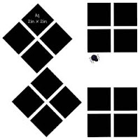
If you like the idea, here are some sketches in square format, US letter and A4 for you to use and adapt. No download as they are only small sketches so feel free to right click and save.

Now I can get stuck into the OPs about Bro’s big day.
Credits:
Digi-Scrap Princess' Charity Kit
Font: Pristina

Wednesday, April 8, 2009

Using PowerPoint to create album pages: Tutorial 01

To keep faith with the mission of getting photos into places they can been seen and enjoyed, I have started work on a series of tutes aimed at the family album maker rather than the true digi-scrapper. If you just want to get those photos into albums, this is for you. If you are a great digi-scrapper then maybe this is for a friend or relative. Please let me know if these are useful and I will keep them coming.

The first tute covers page set up and image resizing and cropping. Here’s how it starts:

I used PowerPoint to make up my album pages for nearly 10 years and it is a great alternative for folks who just want to get that album done without having to go through the learning curve of a program such as Photoshop. Also PowerPoint (PPT) comes with MS Home Office suites so most folks will have it on their computer. I am also aware that Open Office has a program called OOo Impress in its suite, a PPT equivalent, which has the added advantage of being free.

PowerPoint offers several advantages to the family album creator including:
  • all the pages for a particular event are together in the one file – a great advantage for things like weddings and holidays
  • you can easily change the page order
  • you can set up a background template that then works for all pages
  • basic image editing tools allow you to crop, alter brightness and contrast and adjust image size
  • drawing tools allow you to create shadows and borders
  • text boxes and Word Art are on hand and easy to use
Sorry, link has expired. Check the DustyD website instead.

Monday, April 6, 2009

Little pics on a 12x12 page

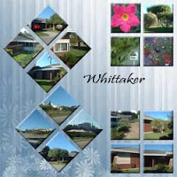
I am finally making a start on my DMIL’s memories book. For years she and DFIL lived in a house near the beach. When they left we took heaps of photos so she could remember how it was. This is one of the pages about that home.

All the pics on this page are 2in x 2 in. Here’s how I did the diamond shape crop in PSE7.
1. Open pic and immediately make a duplicate layer
2. Rotate the whole image 45 degrees right
3. Set crop to 2in by 2 in and make the crop in the duplicate layer
4. Rotate the whole image 45 degrees left
5. Copy the diamond shape over to the template. It should have a transparent background so you won’t have any extra white to worry about.


Credits: BG paper is my own, Font is Pristina. The download file has a flat 12in x 12in template.

Sorry, link has expired. Check the DustyD website instead.

Sunday, April 5, 2009

Adapting templates and a US letter version

Sometimes I use templates exactly as they are and sometimes I adapt them to suit what I am doing. The template I used for today’s set of dusty digitals is one of my favourites and I have used it a lot when doing OPs for wedding albums.

Here I have adapted it by dropping the size of one picture space to allow for a heading and by using a picture space for journaling.

I have so many friends in the US thanks to digi-scrapping that I thought I’d adapt this OP to US Letter size and see how it goes. If there is enough interest then I will do the same with other templates.

Sorry, link has expired. Check the DustyD website instead.

Saturday, April 4, 2009

Make the most of a good background

Time to do the album pages for DG’s 3rd birthday. I digi-scrapped the first page and then used OP templates for the other pages. OPs can look very ordinary but if you carry over a great background, then they suddenly have lots of life and clearly all belong together as a set.

The background for this group of pages was made using a beautiful background paper from Robyn Littlejohn’s Essentials kit overlayed with a low opacity image of the birthday balloons. I used that same background in the OPs. I’ve mentioned how I do this before but it bears repeating. Set up the background, choose the OP template, drag it OVER the background layer and then crop and move pictures into place. Then delete the template layer and continue to embellish. In my case, I added a major element used on the first page to each OP which also helped bind them as a set.
It took me ages to make the digi-scrapped page but the OPs, two of which are shown here, were very quick.

Credits: Robyn Littlejohn’s kits: Essentials and A touch of Spring.
Font: Monotype Corsiva

The download has two version of the same A4 template as shown in the clip opposite.

Sorry, link has expired. Check the DustyD website instead.

Thursday, April 2, 2009

Home made photo book using PowerPoint

My grandkids love to see themselves in photos and especially love it when I make a little story book that is all about them. Now I know you can go the professional route with photo books, and I do that too, but this is the fast, home made version. These books don’t have the polish and pizzazz of professional books but my grandies love them anyway and read them to death. They are ‘for now’ books, not keepsakes.

Here’s my recipe. I create my books using 4 pieces of A4 white 200g card stock printed on both sides. They are printed in landscape with two story pages to a side. The binding is done by punching holes along the centre line and then stitching through the spine with a big needle and strong thread. I use crochet cotton. Too easy! The hard part is working out where the pages go so that when it is all put together, the pages turn over in story order.

I solved that by creating a PowerPoint template with 8 slides, each with the appropriate page number at the bottom of the two sides. Now I can insert images and put in text in the right order. I don’t use the word processor as I prefer the ease with which PPT lets you move and adjust text and images on a page. It is best to downsize your images to 72dpi before inserting them in to PowerPoint. A full story page photo would be about 135mm x 220mm x 72dpi.

Printing has its challenges as you must get the right pages back to back for the book to work. Here is how it goes for a 16 page book.

P1 / P14 back to back with Cover/Back
P3 / P12 back to back with P13 / P2
P5 / P10 back to back with P11 / P4 and
P7 / P8 back to back with P9 / P6

How you layout your book is up to you. I’ve made them two ways as you can see in the image. I’ve also mixed it up – it depends on how many photos I have and how much I want in the story. The examples I’ve given here are my GD’s 3rd birthday. On the back cover, I put a colouring in image so she can add something herself to her book.


The download has the A4 landscape .ppt file as shown on the far left. If you need to alter the page dimensions to suit another page size, go to File/Page Setup and enter your own values.

Sorry, link has expired. Check the DustyD website instead.

Monday, March 30, 2009

Making the most of mobile phone pics

When I got my new iPhone I was entranced with its ability to take halfway decent photos. Not as good as my ‘real’ camera but not too bad either.

My next dusty folder contained only mobile phone images and their resolution meant they looked better as small pics. To make the most of them I made up a page that used nothing larger than a 50mm x 50mm image with the exception of one major photo which was used as background with its opacity set to 50%. There its less than stellar resolution was actually an advantage and added to the overall effect.


Font credit: Billo Dream

The A4 template is in the download. If you do download, a note or comment would be appreciated.

Sorry, link has expired. Check the DustyD website instead.

Thursday, March 26, 2009

Fun space on an A4 template

My next event folder had heaps of photos inside so that called for a template with lots of photo places. I ended up using two versions of the same template to create a 2 page spread in the album. This template has a huge empty space which I’ve labelled ‘Fun space’. You could do all sorts of things here; let your creativity run wild!

I actually went simple and put a major photo in the background. On the left hand side I did get a little creative with layers and created an image with a faded background but with my DGD in full colour. As her page also told a story, I added some close-ups of her face, set transparency to 70% and then used those squares to add story details.


In the download, you’ll find the flat template for both sides.

Sorry, download has expired
Please leave me a little note or comment. I’d love to know how you will use them.

Tuesday, March 24, 2009

A DSP followed by matching OPs

This morning’s task was just too much fun. Now I think I need a good cup of tea and a lie down to recover.

The next batch of dusty digitals was my youngest DGD’s 1st birthday party and I had heaps of images. Such a special event deserved special treatment so I digi-scrapped the first page and then followed it with another 4 matching OPs.
To achieve the matching, I used the same background paper and also followed through with a character I created based on DGD’s birthday cake, a lady bug. I ferreted around my collection of OP templates for ones that matched what I wanted and away I went. When all pictures were in place in a page, I deleted the template which let the backgrounds show through. Then I grouped the images and shrunk them down a bit to allow a border of background around the edge. Then I put the ladybug in and job done.

Credits for the DSPage: Digi-Scrap Princess's Kit 'Charity'
Her blog is here.

The A4 template for the top OP in the combo is below for you to download.

Sorry, download has expired

Monday, March 23, 2009

Managing files

I’ve just had four very busy days. Thursday and Friday I did relief teaching in the sort of school they make movies about (rough tough kids with heaps of attitude) and then Saturday and Sunday I did a botanical water colour workshop in Kings Park. It may surprise you to know I enjoyed both experiences although the first I’m not in a great hurry to repeat anytime soon, need to get my energy levels back first.

So it’s back to my dusty collection of family photos waiting to be put into the album.

Now I like to think I’m well organised when it comes to storing my digital images but then something happens that blows that conceit right out of the water. In preparation for doing MiL’s album, I trawled my collections and copied anything that might be useful into one big folder so that DH could then go through and work out what he wanted to include.

But my system had failed at the final hurdle, renaming individual files, so the folder I prepared had heaps of files with names like DSC_0035.jpg and PRscan_049.jpg. How embarrassing! Some were better in that they had the date and event front end, eg 050623-Ds-21st-006.jpg. Others, particularly some of the scans of family photos and negatives, had details of the actual photo itself, eg 601225-S&M-under-tree.jpg, so it wasn’t all bad. But it was a reminder to be better disciplined in future and follow the system.

Here’s my system for digital photos coming in as new images, scans of older images I do a little differently so they may get their own post another day.

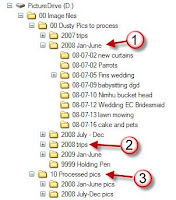
The clip from my hard drive shows how it works. I create a folder for each event within another folder that covers a 6-month time period (1). Trips have their own yearly folder (2). Folders are named using a yy-mm-dd convention so that the computer’s filing system displays them in true date order.

As I create album pages for the events, their folders are moved into the Processed pics folder (3). When an entire year is processed, the folders are cut to DVDs to share around the family, an effective way to not only share but to create off-site backups as well. The folders are moved into the Annual Collections folder.

Now the bit I’m not so good at doing. Files within each event folder are renamed using a yymmdd-event-nnn.jpg convention. The nnn is generated by whatever means I have used to rename the files in the folder. This is usually inside ACDSee but you can also do it in Windows Explorer although its method is a little odd at first. Basically, you select a range of files and use a Rename command; in Windows it is under the File menu and in ACDSee it is in the Edit menu. Specify the new name you want and how you want the numbering to be formatted. ACDSee gives you options about how you want the numbering to be done, Windows doesn’t.

Do you have a great system? Please share!

Friday, March 20, 2009

In the midst of OPs there comes a DSP

This day’s work on the family album was very rewarding. I had already done a 12x12 layout for the next set of photos which was posted at the Digital Design Den (sadly now closed) and I just needed to convert it into an A4 page.

So here are the before and after images. The 12x12 version was done as a selective colouring challenge. By the time I got to the A4 version I was more interested in getting the page finished, printed and into the album. Hopefully the family won’t care that I didn't carry the idea across to the new photos.

The conversion is very simple. Open the 12x12, alter image size to 210mm wide, and then alter the canvas size to be 210mm wide and 297mm deep with the original image at the top of the page. Most times I can just stretch the background to fill the empty space at the bottom. Then the page has to finished off. This one just had some extra frames added but sometimes the balance of the page needs to be tweaked to accommodate the change in size and shape.

I used Sandy Collin’s ‘Exotic Rust’ kit to create the page. Fonts used are: Eccentric Std and Pristina.

....

Wednesday, March 18, 2009

Boring but functional

Today’s page is boring but functional. Sometimes that is the fate of an OP, not every page gets to really shine. It is also an example of getting two sets of photos on to the one page. Sometimes you only have a few shots for each event and stretching them onto a full album page is just too much ink and too much good photo paper. Better to let them share a page and cut a cost or two.

If your events are sharing a page, then you will still want to get the most out of the photos so don’t crimp the image for the sake of space for the story. Most images have some space that can take a bit of text. Look for very dark or very light sections, both very useful for overlaying text and titles without sacrificing the image and its essential message. Advertisers do it all the time and we think nothing of it and as for magazine covers…

Looking at the page below a true digi-scrapper might have an eyebrow lifting moment and mutter something like ‘that’s not a real layout!’ And they’d be right, it isn’t. It is a page for a family album and in the sequence of events in our family; poor Nhimu had her op around the same time as I was babysitting my DGD so the photos ended up following each other. Such is life.


This template is very simple and it also offers opportunities to swap bits around. It is a useful OP for wedding and holiday albums. If you want to, you can take out one of the smaller images and substitute titles, stories or other embellishments.

This is good. Thanks to the Blog I now I have two more lots of photos moved from the ‘to be processed’ dust pile to the ‘completed’ pile. I may as well make the most of it because as soon as DH has sorted through the photos for MiL’s book I’ll be back to 12x12 with a vengeance and the family album will fall behind again.


The download has the flat 300dpi jpg template ready to use as a base.

Sorry, link has expired (available for one month)

Tuesday, March 17, 2009

A4 template and construction method

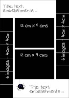
Here’s the template for the A4 version of the 12x12 I posted yesterday. This is the size I print at home for putting into my family albums.

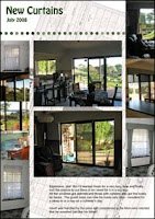
The sample page shown here was created in about 15 minutes from start to print. Not bad when the aim is to get the dusty photos off the hard disk and into the family album and if you can read the date you will see I am currently about 8 months behind, time to do some catching up. The subject matter, getting new curtains, isn’t earth shattering but it was a significant event in our house so worth going in our album/family visual diary.

Here’s the method I used:
  • Open the flat jpg in Photoshop Elements and IMMEDIATELY make a duplicate and rename it to fit the pictures being dusted off
  • Open up the images I want to use
  • Then for each part of the base template:
    • set the cropping tool to the required size making sure I have the dpi set as well, in this case to 300
    • crop image and drag it over to where it belongs using the base template as a guide
  • For added interest, I scanned the invoice, added it under the photos and reduced its opacity to fade it a bit
  • Add some text to tell the story
  • Add a line of decorative dots, a unifying feature in a lot of my album pages
  • Hide the base layer and review the page, moving things around if necessary
  • Save
  • Print
It suited my purpose to have some images 4x8 rather than the 4x4 on the template but this was an easy adaptation to make. If you use these templates, you’ll see ways to adapt them for your purposes too.


The download has both a layered psd file and also a flat jpg.

Sorry, download link has expired.